Devblog #3
This time I focused more on improving the art with an emphasis on making the rooms feel less empty.
The reason for that is something I've been thinking about for a long time, something which unfortunately won't come to fruition, the whole castle being explorable. As much as I want it I decided against it mainly for two reasons, the first one being that it will take an immeasurable amount of time to complete(there are ten floors after all) and the second and the most important one is that even if I succeed, the castle will feel exceedingly empty and bland, just like in the previous version. So instead, I decided to polish everything that already exists to the maximum, filling those rooms with meaningful objects and then adding some extra places here and there. On top of that, I'm remaking the game's endings and objectives so I believe this decision will contribute for the better as a whole.
These are the improvements I made this time:
- The main character clothes are almost finished.
- The new main character now works with the animations of the old one ( still not in the game, just testing).
- Added a small pause after each jump.
- Sculpted Vermis' teeth.
- Worked on some facial expressions for Vermis.
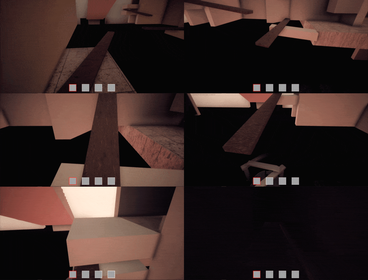
- Remade the wooden plank puzzle, still work in progress so the gif below is not the final representation.
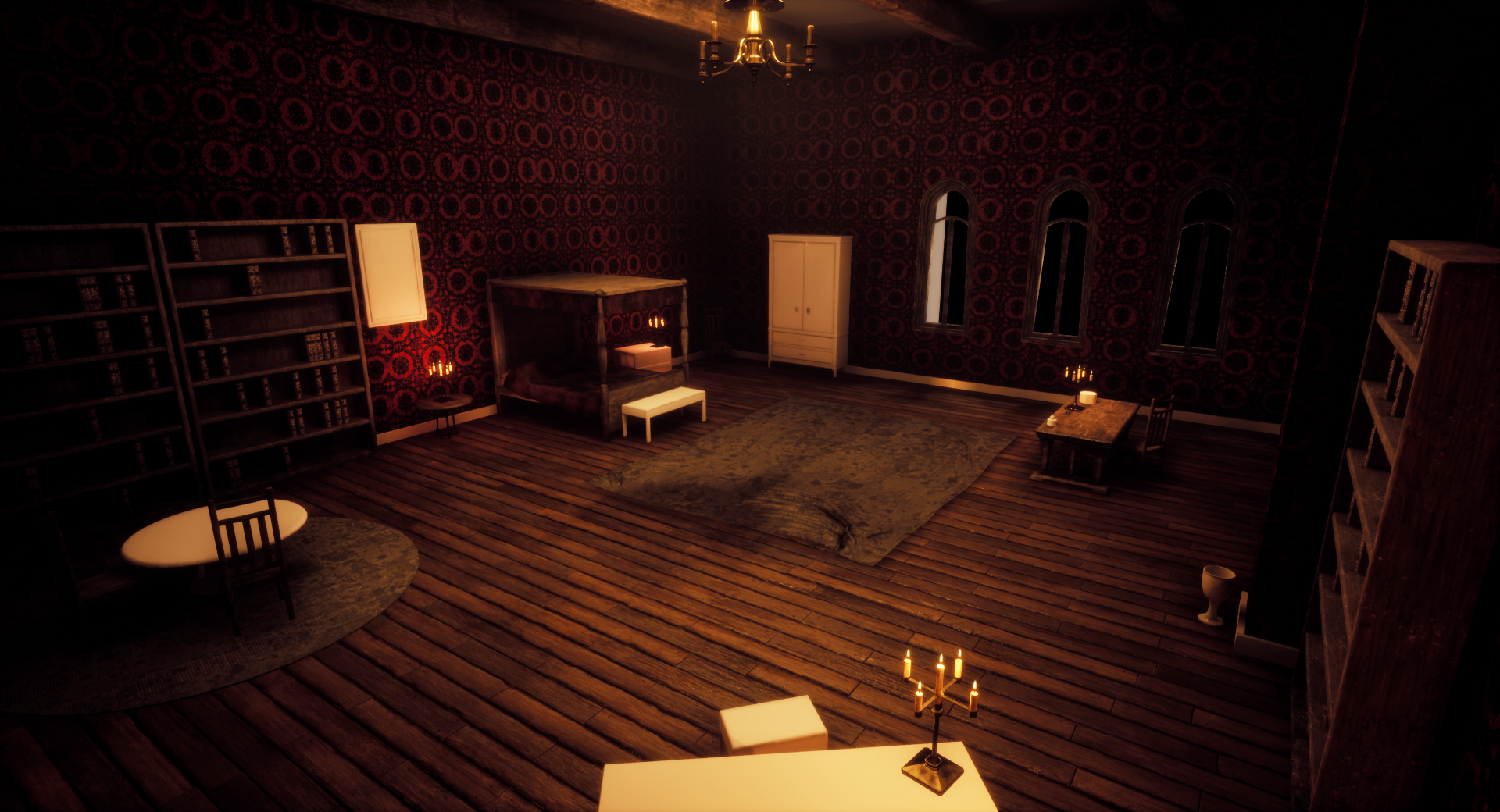
- Improved Vermis' room further.
- Created an open book animation.
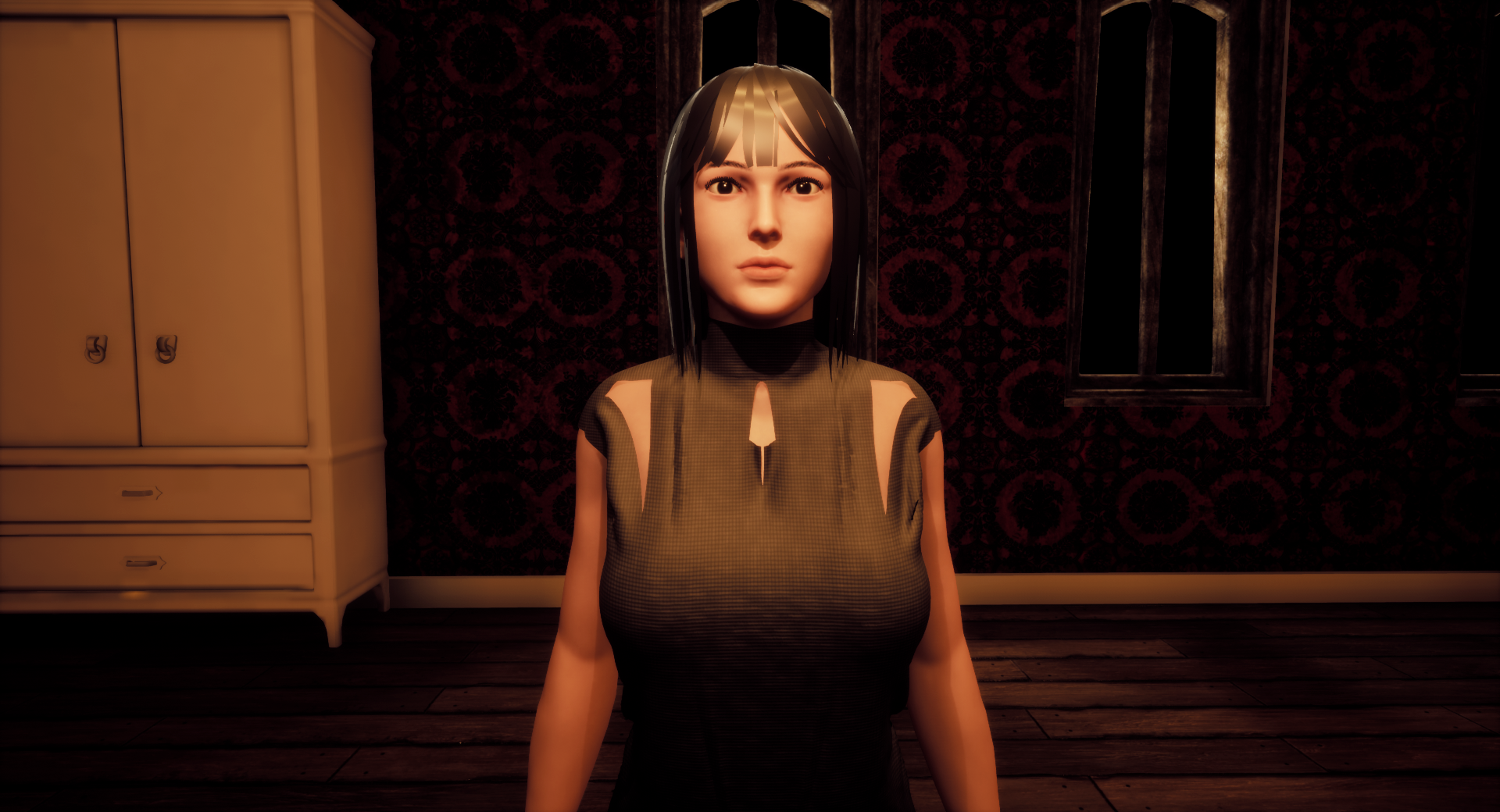
- Added a posed and improved Vermis to the game.
- Added doors to the library and Vermis' room.
- Modeled the balance.
- The monster now wanders the labyrinth in search of the main character when triggered.
- Camera shaking.
- Wrote some dialogue for Vermis.
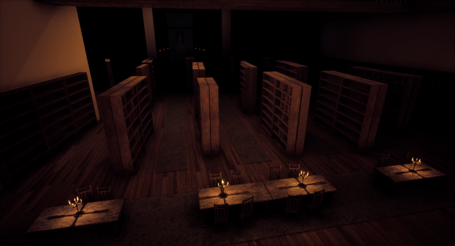
- Finally added all the new bookshelves to the library.
- Thought of all the endings, there will be still three but they'll be all different.
- Improved the color puzzle.
- Improved the guest waiting room.
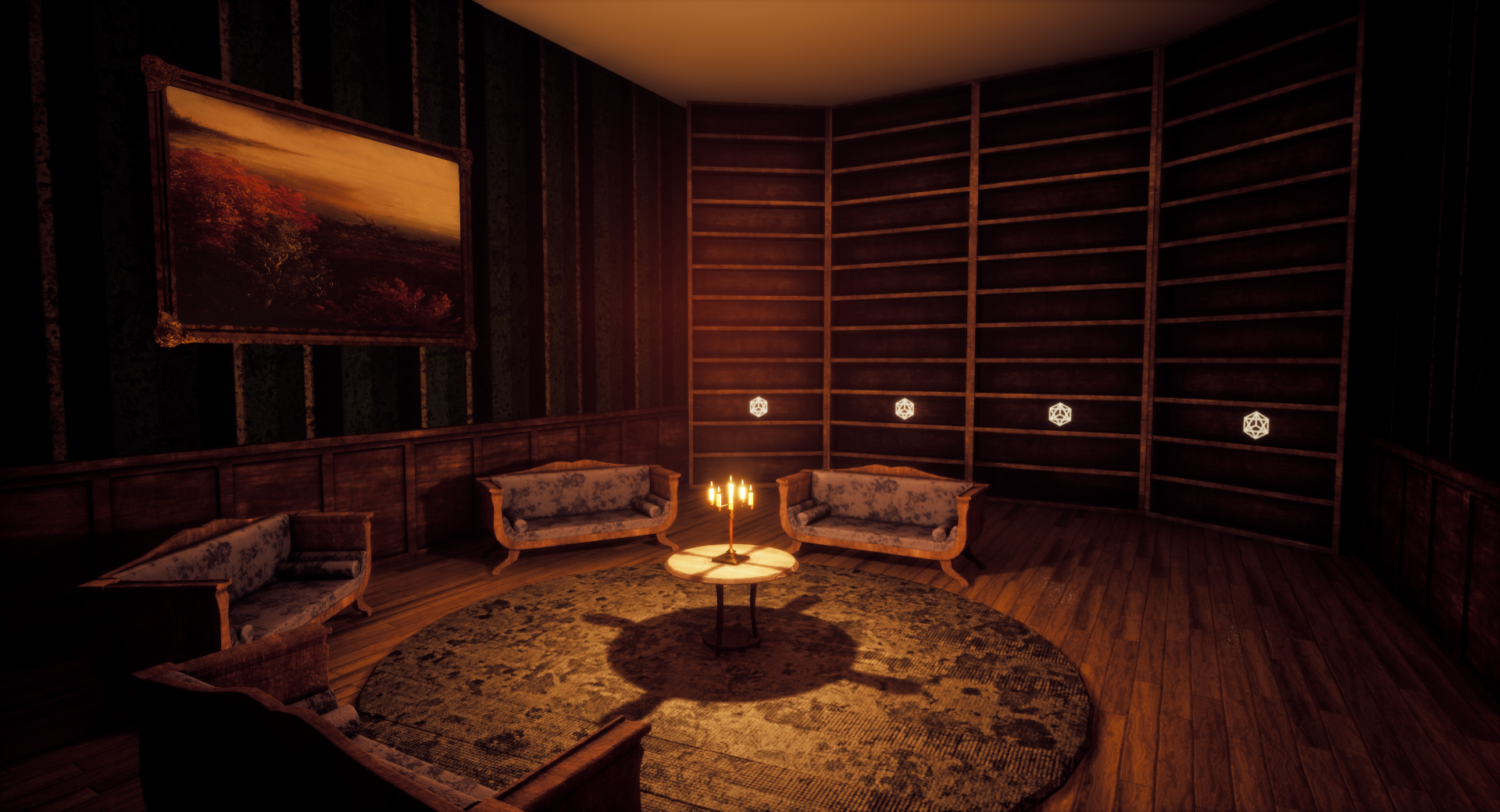
- And a lot of other minor fixes.
Get Pulcra Vermis
Pulcra Vermis
Help Vermis find her body.
| Status | Released |
| Author | ParagonEarth |
| Genre | Adventure, Puzzle |
| Tags | 3D, Atmospheric, Exploration, Fantasy, First-Person, Horror, Multiple Endings, Singleplayer, Unreal Engine |
More posts
- Devblog #5.1Jun 14, 2020
- Devblog #5May 31, 2020
- Devblog #4May 03, 2020
- Devblog #2Mar 20, 2020
- Pulcra Vermis:ReFeb 29, 2020
- Future PlansSep 10, 2019
- Version 2 ReleasedSep 08, 2019
- Version 2 Coming SoonSep 06, 2019
Comments
Log in with itch.io to leave a comment.
while a whole 10 floor pulcra vermis sounds awesome, your choice about limiting the scope is understandable. as a player, i'd much rather have a small, polished, meaningful game experience than one that's massive but hollow.
also, the rooms are looking really snazzy! it's crazy how far they've come from the original pulcra vermis. i like how some of the wall colors subtly mirror the colors of the three books. just need a blue room, maybe the library?
keep up the good work. btw love these devblogs. informative, well structured, released at a good pace, and lots of pics/gifs.
Yes, it's regretful but I can always release some updates in the future expanding it.
Thank you, that's my goal now, making those rooms as snazzy as possible! As for the colors, the red Vermis' room was intentional( the guest waiting room wasn't, I chose the color randomly but let's pretend it was), and now that you mention it making the library blue is a great idea, will do some tests.
And thank you, I will, at the start I didn't feel enthusiastic at all about writing devblogs but now it kind of become part of the workflow, it helps to organize and sort tasks in a way that doesn't feel as constraining.